The Spectrum Clock explores how time can be told through colour, instead of string of text (like 10th October, 2022 14:45) that we are normally used to.
The Brief
The brief was set out by university staff, with one simple question. "Explore interesting ways to visually communicate time". It was such an open question which presented infinite amounts of possible avenues this project could've go on.
Initial ideas
- Creating codes/IDs for every second possible under the gregorian calendar (like what3words but for time).
- My last initial idea and the one I ended up going forward with was trying to tell the time through colour, My idea stemmed around the concept of assigning each number from 0-9 it's own unique colour and telling the time through that.
- An anonymous social media board where users could go and share what happened to them at any particular moment in time (inspired by the anonymity and sharing of The Unsent Project).
- A climate count-up clock where users could see the impact of humans on Earth and it's climate by the second, showing in real time how many plastic bottles are dumped into the ocean, CO2 into the atmosphere and other variables which would intentionally create a sense of anxiety and stress in the user to encourage the user to make more climate concious choices.
Development
As mentioned in initial idea #2, I decided to go with the idea of telling the time through colour.
It was inspired by the perceptual phenomenon Synesthesia, in particular, Grapheme-color synesthesia which is where a individual (or synesthete) associates numbers and letters with colours. They may see the letter 'A' as blue and the letter 'B' as yellow and so fourth. I encourage you to read the Wikipedia articles linked for more information.
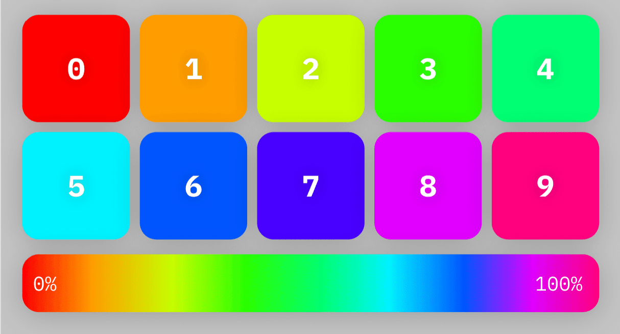
My first step in this was creating a colour palette which could be translated into numbers. It was essentially a key/value pair set with each number 0-9 assigned it's own unique colour. I created the following palette by starting with pure HSL red being assigned to 0 (
hsl(0,100,50) = 0) then incremented by 36 degrees (360 degrees of colour in HSL ÷ 10) for each number (hsl(36,100,50) = 1, hsl(72,100,50) = 2 and so on).
Clock Development
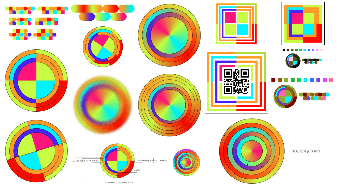
After creating the palette, I then started to develop the clock itself. I started by creating a simple clock face with the numbers 0-9 in the correct positions. I further carried on experimenting with it to a point where I was happy with it.

Putting it in an app/website
During this phase, I also developed the clock a little more to give it a cleaner look. More specifically, by dropping the outlines in favour of some shadows between the rings.
Generating overlapping gradients in CSS
During my development process, I created a semi-working JavaScript prototype of the clock. I have more information on this later on in the article but I would like to mention the process of generating the overlapping gradients in CSS. My designs were created in Figma and used overlapping angular gradients (confusingly enough they are actually defined as conic gradients in CSS) in the rings and I wanted to replicate the gradients in CSS. By closely analysing the "Inspect" tab in Figma, I was able to conclude that the gradients could be "overlapped" by starting the gradient a certain number of degrees before
0 and ending the gradient a certain number of degrees after 360. I have a visual diagram and pseudocode of how I did this below.The Outcome
I created a series of mock-ups and prototypes to demonstrate what a finished and built version of the Spectrum Clock would look and function like.
Animated Phone Mock-up
There is also a version of this mock-up of the raw UI which isn't placed into a phone. Available on Vimeo.
Prototypes
I created two prototypes for this project, one in Figma to showcase the UI and features of The Spectrum Clock's website and another in JavaScript. I had to create the JavaScript prototype as Figma was unable to showcase how I wanted the clock to look and feel like.
Figma Prototype
The Figma Prototype was created to primarily demonstrate the user flow around the app/website. I tried to make it as close to a real app as possible, with the exception of the clock itself. Figma's prototyping functionality (at the time of the project) was not able to animate the clock itself, so I had to create a static image of the clock and place it in the prototype. I also created a few other pages to demonstrate the other features of the app/website.
The prototype is available on Figma. I recommend viewing it on a desktop browser as Figma's prototype viewer functions best on larger screens.
The prototype is available on Figma. I recommend viewing it on a desktop browser as Figma's prototype viewer functions best on larger screens.
JavaScript Prototype
I created a JavaScript prototype of the clock to showcase how it would look and feel like, filling in where Figma's prototype functionality fell short. Unfortunately, I was not able to get the JavaScript prototype to a point where I was happy with it, browser engines do not support animation from gradient to gradient and as a result the JavaScript result ended up very 'jumpy' and not as smooth as I wanted it to be. However I was able to successfully make it show the colours for the user's current time as well as any time/date combination they desire through the use of a date picker control at the top of the prototype.
I used the following tech stack for the prototype.
I used the following tech stack for the prototype.
- React, as a JavaScript framework.
- Create React App, as a boilerplate for the project.
- TypeScript, to manage the types of the project and to make the code more readable and safe.
- Stitches, CSS-in-JS library for styling.
- Zustand, state management library for React.